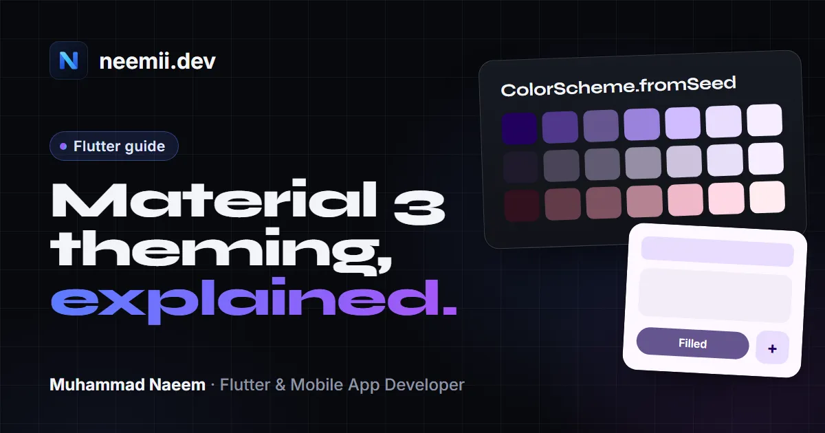
Most Flutter apps start with one line of theming: ColorScheme.fromSeed(seedColor: Colors.blue). It works, the app looks fine, and then the client asks why the buttons aren’t the exact blue from their logo.
This post explains what that line actually does, how to build light and dark themes on top of it, which colour role to use where, and how to keep brand colours exact when the generated ones aren’t good enough. All the code is plain Flutter, no packages except where I say so.
Material 3 is already on
Since Flutter 3.16, ThemeData.useMaterial3 defaults to true. If you create a new app today, you’re on Material 3 whether you asked for it or not. You’ll see it in the rounder buttons, the tinted surfaces and the new NavigationBar style.
You can still set useMaterial3: false, but the Flutter team has said Material 2 support will be removed eventually (see the migration guide). Don’t build a new app on it.
The minimal Material 3 theme is this:
MaterialApp(
  theme: ThemeData(
    colorScheme: ColorScheme.fromSeed(seedColor: const Color(0xFF1565C0)),
  ),
  home: const HomePage(),
);
ThemeData(colorSchemeSeed: ...) is a shortcut for the same thing. I prefer building the ColorScheme explicitly, because you’ll want to reuse it for the dark theme and for overrides.
What fromSeed does with your colour
ColorScheme.fromSeed doesn’t use your seed as primary. It uses it as input to an algorithm. The API docs say it directly: the seed colour “may not wind up as one of the ColorScheme colors.”
Here’s what happens, simplified:
- The seed is converted to HCT (hue, chroma, tone). Hue is the colour, chroma is how colourful it is, and tone is lightness from 0 (black) to 100 (white). Tone is designed so that two colours with the same tone have the same perceived lightness, which makes contrast predictable.
- From that hue and chroma, the algorithm builds tonal palettes: one for primary, secondary, tertiary, neutral, neutral variant and error. Each palette is the same hue at many tones.
- Each colour role picks a fixed tone from its palette. In a light scheme,
primaryis a dark-ish tone (around 40) so that white text on it is readable; in a dark scheme it’s a light tone (around 80). - A variant decides how much of the seed’s chroma survives. The default,
DynamicSchemeVariant.tonalSpot, deliberately calms colours down into pastel-ish palettes.
So if your seed is a bright, saturated orange at tone 65, your primary comes out as a darker, less saturated orange at tone 40. That’s not a bug. It’s the system guaranteeing contrast.
Changing the variant
Newer Flutter versions added a dynamicSchemeVariant parameter, along with contrastLevel:
final scheme = ColorScheme.fromSeed(
  seedColor: const Color(0xFFFF6D00),
  dynamicSchemeVariant: DynamicSchemeVariant.fidelity,
  contrastLevel: 0.0, // -1.0 to 1.0; 0.5 is medium, 1.0 is high contrast
);
The options worth knowing:
tonalSpot(default): soft, low-chroma palettes. Safe and readable, but rarely “on brand”.fidelityandcontent: keep the palettes much closer to the seed. Use these when the seed is a brand colour and you want the app to feel like it.vibrantandexpressive: more colourful, with hue shifts for secondary and tertiary.monochromeandneutral: greyscale or near-greyscale.rainbowandfruitSalad: playful, with rotated hues.
Check the DynamicSchemeVariant docs for the version you’re on. Even with fidelity, primary is still not guaranteed to be your exact hex value; it’s just much closer.
The fastest way to see the difference is to try it. My free Flutter Material 3 theme generator previews all 34 colour roles in light and dark mode for any seed, so you can see what fromSeed will give you before you write the code.
Light and dark themes
One seed, two brightnesses. Build both schemes from the same seed, pass them to theme and darkTheme, and let themeMode choose:
const seed = Color(0xFF1565C0);

final lightScheme = ColorScheme.fromSeed(seedColor: seed);
final darkScheme = ColorScheme.fromSeed(
  seedColor: seed,
  brightness: Brightness.dark,
);

MaterialApp(
  theme: ThemeData(colorScheme: lightScheme),
  darkTheme: ThemeData(colorScheme: darkScheme),
  themeMode: ThemeMode.system, // or ThemeMode.light / ThemeMode.dark
  home: const HomePage(),
);
ThemeMode.system follows the phone’s setting, and it’s the default. If your app has a theme toggle in settings, store the user’s choice (for example with shared_preferences) and pass it into themeMode from your state management.
Two things to get right:
- Pass
brightnesstofromSeed. Settingbrightness: Brightness.darkonThemeDatabut giving it a lightColorSchemedoesn’t work:ThemeDataasserts that the two brightnesses match. - Don’t invert colours yourself. The dark scheme uses different tones from the same palettes. A light theme’s
primaryon a dark background is usually too dark to read.
From my own work: the dark-mode bugs I’ve fixed came from hard-coded colours. Cards and screens mixed fixed colour values with theme colours, so in dark mode some cards didn’t match the design and some text lost contrast. The fix was to choose one proper ColorScheme for light and dark and replace the hard-coded values with its roles, so every screen took its colours from the same source.
Colour roles and what they’re for
A Material 3 ColorScheme is a set of named roles, not a palette of “blue 500, blue 700”. The name tells you where the colour belongs. Every colour that’s meant for a background has an on partner for text and icons on top of it, and the pair is generated to meet contrast requirements.
| Role | Use it for |
|---|---|
primary / onPrimary |
The most important actions: filled buttons, FAB, active states |
primaryContainer / onPrimaryContainer |
Less prominent emphasis: selected chips, highlighted cards, tonal buttons |
secondary, tertiary (+ on, containers) |
Supporting accents; tertiary for contrasting highlights |
error / onError, errorContainer |
Error states, destructive actions, validation messages |
surface / onSurface |
The default background and the default text colour |
onSurfaceVariant |
Secondary text, icons, captions |
surfaceContainerLowest … surfaceContainerHighest |
Layered backgrounds: cards, sheets, dialogs, nav bars, text fields |
surfaceDim, surfaceBright |
Surfaces that should look slightly darker or brighter than surface |
outline, outlineVariant |
Borders; outlineVariant for dividers and decorative lines |
inverseSurface, onInverseSurface, inversePrimary |
Elements that sit “against” the theme, like snackbars |
shadow, scrim, surfaceTint |
Shadows, modal overlays, and the tint used for elevation |
The full list with descriptions is in the ColorScheme API reference. The rule of thumb: if you put text on X, its colour is onX. Text on primaryContainer is onPrimaryContainer, not onPrimary.
The surface roles changed in Flutter 3.22
Flutter 3.22 added the surfaceContainer family (surfaceContainerLowest, surfaceContainerLow, surfaceContainer, surfaceContainerHigh, surfaceContainerHighest) plus surfaceDim and surfaceBright, and deprecated three older roles:
| Deprecated | Use instead |
|---|---|
background |
surface |
onBackground |
onSurface |
surfaceVariant |
surfaceContainerHighest |
Components were updated to match: a Card uses surfaceContainerLow, a NavigationBar uses surfaceContainer, dialogs use surfaceContainerHigh. The 3.22 breaking change note has the full mapping. Run dart fix --apply and it will rename most of the deprecated usages for you.
In practice, “container” here means “a background that sits on top of surface”. Pick a higher container for things that should stand out more:
Container(
  color: Theme.of(context).colorScheme.surfaceContainerHigh,
  padding: const EdgeInsets.all(16),
  child: Text(
    'Order summary',
    style: TextStyle(color: Theme.of(context).colorScheme.onSurface),
  ),
);
Read colours from the theme, not from Colors
This is the habit that makes dark mode work for free. Anywhere you’d type Colors.blue or Color(0xFF...) inside a widget, read the role instead:
// Bad: fixed colours, broken in dark mode
Text('Total', style: TextStyle(color: Colors.black87));
Icon(Icons.check, color: Colors.blue);

// Good: follows the theme in light and dark
final colors = Theme.of(context).colorScheme;
Text('Total', style: TextStyle(color: colors.onSurface));
Icon(Icons.check, color: colors.primary);
Better still, often you don’t need a colour at all. A Text with no colour already uses onSurface through the default text theme, and a FilledButton already uses primary and onPrimary. Setting colours by hand on Material widgets is how themes drift apart.
For text styles, do the same with Theme.of(context).textTheme:
Text('Checkout', style: Theme.of(context).textTheme.titleLarge);Component themes
ColorScheme sets the colours. Component themes set shape, padding and which roles a widget uses, once, for the whole app. Keep these small; every override is something you maintain.
ThemeData buildTheme(ColorScheme colors) {
  return ThemeData(
    colorScheme: colors,
    appBarTheme: AppBarTheme(
      backgroundColor: colors.surface,
      foregroundColor: colors.onSurface,
      centerTitle: false,
    ),
    filledButtonTheme: FilledButtonThemeData(
      style: FilledButton.styleFrom(
        minimumSize: const Size.fromHeight(48),
        shape: RoundedRectangleBorder(borderRadius: BorderRadius.circular(12)),
      ),
    ),
    cardTheme: CardThemeData(
      color: colors.surfaceContainerLow,
      elevation: 0,
      margin: EdgeInsets.zero,
      shape: RoundedRectangleBorder(
        borderRadius: BorderRadius.circular(16),
        side: BorderSide(color: colors.outlineVariant),
      ),
    ),
    inputDecorationTheme: InputDecorationTheme(
      filled: true,
      fillColor: colors.surfaceContainerHighest,
      border: OutlineInputBorder(
        borderRadius: BorderRadius.circular(12),
        borderSide: BorderSide.none,
      ),
    ),
  );
}
Then theme: buildTheme(lightScheme) and darkTheme: buildTheme(darkScheme). Because every value comes from colors, the same function produces a correct dark theme.
A note on types: cardTheme takes a CardThemeData in current Flutter versions (older code used CardTheme). Some other theme parameters are mid-migration to ...ThemeData classes too, so if the analyzer complains after an upgrade, check the ThemeData constructor for your version.
Text theme with your own font
Set the font family once on ThemeData, and the Material 3 type scale (displayLarge down to labelSmall) uses it:
ThemeData(
  colorScheme: lightScheme,
  fontFamily: 'Inter', // declared under fonts: in pubspec.yaml
);
If you use the google_fonts package instead of bundling the font, apply it to the base text theme so sizes and weights stay Material 3’s:
final base = ThemeData(colorScheme: lightScheme);

final theme = base.copyWith(
  textTheme: GoogleFonts.interTextTheme(base.textTheme),
);
Building on base.textTheme matters. It already has the right colours for the scheme’s brightness, so the same code works in dark mode. For release builds, bundle the font files rather than downloading them at runtime; the google_fonts docs explain how.
Brand colours that must stay exact
fromSeed is fine until a designer or client says “the primary button must be #E30613”. You have two options.
Option 1: generate, then override specific roles
fromSeed accepts any role as a parameter. Generated values fill everything you don’t pass:
const brandRed = Color(0xFFE30613);

final lightScheme = ColorScheme.fromSeed(
  seedColor: brandRed,
  dynamicSchemeVariant: DynamicSchemeVariant.fidelity,
  primary: brandRed,
  onPrimary: Colors.white,
);
You can do the same afterwards with copyWith, which is useful if the scheme comes from somewhere else:
final scheme = ColorScheme.fromSeed(seedColor: brandRed)
    .copyWith(primary: brandRed, onPrimary: Colors.white);
The catch: overriding primary doesn’t update anything else. primaryContainer, inversePrimary and surfaceTint still come from the generated palette, and onPrimary is only correct if you set it. Check the contrast of every pair you touch; WCAG asks for at least 4.5:1 for normal text. And decide separately for dark mode. A saturated brand red that works as a light-mode button is often too intense as a dark-mode primary, where the generated lighter tone usually reads better.
Option 2: an explicit ColorScheme
If the design system already defines every colour, skip the generator and write the scheme out:
const lightScheme = ColorScheme(
  brightness: Brightness.light,
  primary: Color(0xFFE30613),
  onPrimary: Color(0xFFFFFFFF),
  primaryContainer: Color(0xFFFFDAD5),
  onPrimaryContainer: Color(0xFF410001),
  secondary: Color(0xFF775651),
  onSecondary: Color(0xFFFFFFFF),
  error: Color(0xFFBA1A1A),
  onError: Color(0xFFFFFFFF),
  surface: Color(0xFFFFF8F7),
  onSurface: Color(0xFF231918),
  // Set the rest too: tertiary, surfaceContainer*, outline, inverse roles...
);
Only brightness, primary, onPrimary, secondary, onSecondary, error, onError, surface and onSurface are required. Every other role falls back to one of those when you leave it out, which is how you end up with cards, nav bars and text fields that are all the same colour as the background. If you go explicit, fill in all the roles for both light and dark.
Writing 34 roles twice by hand is tedious and easy to get wrong. The theme generator I mentioned above can output either version: fromSeed code, or a full explicit ColorScheme for light and dark that you can then edit.
What I do for client brands: when a client’s exact brand colour matters, I write the full ColorScheme out explicitly instead of relying on fromSeed. Every role is then a fixed value the client can approve once, and nothing shifts after a Flutter upgrade or when someone changes the seed.
Dynamic colour on Android 12+
On Android 12 and later, the system generates a colour scheme from the user’s wallpaper. Material 3 apps can use it so they match the rest of the phone. Flutter doesn’t read it on its own; you need the dynamic_color package from the Material team.
flutter pub add dynamic_colorWrap MaterialApp in DynamicColorBuilder. It gives you nullable light and dark schemes: null on iOS, web, and Android versions without dynamic colour, so you always need a fallback.
import 'package:dynamic_color/dynamic_color.dart';
import 'package:flutter/material.dart';

const seed = Color(0xFF1565C0);

class App extends StatelessWidget {
  const App({super.key});

  @override
  Widget build(BuildContext context) {
    return DynamicColorBuilder(
      builder: (ColorScheme? lightDynamic, ColorScheme? darkDynamic) {
        final light = lightDynamic ?? ColorScheme.fromSeed(seedColor: seed);
        final dark = darkDynamic ??
            ColorScheme.fromSeed(
              seedColor: seed,
              brightness: Brightness.dark,
            );

        return MaterialApp(
          theme: ThemeData(colorScheme: light),
          darkTheme: ThemeData(colorScheme: dark),
          home: const HomePage(),
        );
      },
    );
  }
}
Two practical points:
- Brand apps usually shouldn’t use it. Dynamic colour replaces your brand palette with the user’s wallpaper. That’s great for utilities, notes or reader apps, and wrong for a bank or a food delivery app whose identity is its colour. Ask before adding it.
- Keep semantic colours yours. If you have custom colours like “success green” or a status colour, the package’s
harmonized()extension shifts their hue slightly towards the dynamic primary so they don’t clash, without losing their meaning.
Also check the result on a real device. Depending on the package and Flutter versions, a dynamic scheme may not fill every one of the newer surface container roles the way fromSeed does. If cards and backgrounds look identical, one workaround is to rebuild the scheme from the dynamic primary: ColorScheme.fromSeed(seedColor: lightDynamic.primary).
Common mistakes
Hard-coded colours in widgets. Colors.white backgrounds and Colors.black text look fine in light mode and break in dark mode. Search the codebase for Colors. and Color(0x outside your theme file.
A light scheme in the dark theme. darkTheme: ThemeData(colorScheme: ColorScheme.fromSeed(seedColor: seed)) gives you a light scheme in dark mode. Pass brightness: Brightness.dark.
Expecting primary to equal the seed. It won’t with the default variant. Use fidelity, override primary, or go explicit.
Overriding primary without onPrimary. If you change the background role, you own the contrast of its on partner.
Using primary for everything. If every card, header and chip is primary, nothing stands out. Most of the screen should be surface and surfaceContainer*; keep primary for the actions that matter.
Still using background and surfaceVariant. They’re deprecated. Move to surface and surfaceContainerHighest, and remember that components now use the container roles, so a custom explicit scheme without them looks flat.
Pairing roles wrongly. Text on primaryContainer is onPrimaryContainer. Text on surfaceContainerHigh is onSurface or onSurfaceVariant. There’s no onSurfaceContainer.
Building the scheme in build(). Generating a ColorScheme on every rebuild of MaterialApp is wasted work. Create it once (a top-level final, or cached in your state) unless it really depends on changing input like dynamic colour.
Summary
- Material 3 is the default since Flutter 3.16. Start from
ColorScheme.fromSeed. fromSeedbuilds tonal palettes in HCT and picks tones for contrast, soprimaryusually differs from the seed.dynamicSchemeVariant: DynamicSchemeVariant.fidelitykeeps it closer.- Build light and dark schemes from the same seed and let
themeModechoose. - Use roles by meaning:
primaryfor key actions, containers for softer emphasis,surfaceandsurfaceContainer*for backgrounds, and always the matchingoncolour for content. - Read colours from
Theme.of(context).colorScheme, never fromColorsinside widgets. - For exact brand colours, override specific roles or write an explicit
ColorSchemefor both brightnesses. - Use dynamic colour only when the app doesn’t depend on a brand palette.
To try seeds and variants without running the app, use the free Flutter Material 3 theme generator. And if you’d like a Flutter app built with a theme that works in light mode, dark mode and on brand from day one, see my Flutter app development service or tell me about your project.
Need a Flutter app built? Tell me about your project, or see case studies of apps I’ve worked on.